
I've been working on a simple design for a card to demonstrate how to use the print & cut feature of Silhouette. Since I my target audience was Silhouette beginners I wanted to make something with very little requirements, but at the same time pleasing to the eye. So here is what I came up with:
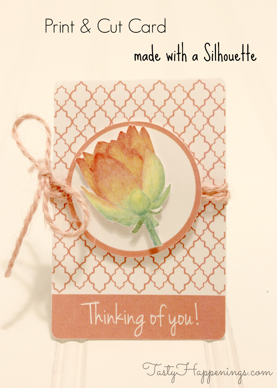
I used the flower and morrocan Silhouette files that are already included in the software. But today I'm not going to talk about how I designed it (sorry... I am saving this tutorial for a super special surprise for you, I think it will be worth waiting!).
Today I will be using this as an example to show you how to make a basic card "pop".

So here are the 5 principles I used while designing a card that "pops":
- Layer cutout elements - This is where the little square foam adhesives come in handy. Instead of making your design all in one paper, think of ways to create elements that will be cut and glued on top of each other (with the help of those wonderful foam adhesives!). Of course having a Silhouette really helps in cutting the intricate designs. In this example I used a circle and flower as separate layers.
- Use a different material - I love mixing up different textures and materials with the card stock. Here I used some twine wrapped around the card stock. But you could use fabric, buttons, stitching, anything, really!
- Mix pattern & plain - A good mix of some pattern and plain background are essential. Just using a pattern as a background may not give the pop that a card needs. Notice now adding the strip of plain pink as a background to my text, made the pattern more interesting to look at. Same thing goes for the outline of the circle.
- Stick to color schemes - I love colors, but sometimes it's just so hard to know which two colors go well together. Especially when coloring in the computer when the printed version always turns out to be slightly different. That is why you need a color scheme! In this case, the main element is the flower and this particular shape already comes in these colors (it is a print & cut shape, meaning you don't need to paint it or create cut lines - the best of both worlds when it comes to P&C). You can search for this type of designs at the Silhouette Online Store. Just type "print and cut" into the search box.
- Download and install fonts - Choosing an appropriate font for the text in your card is a lot of fun. I especially love the handwritten ones. I used Jenna Sue for this project. What I wanted to point out (this actually took me a while to realize) is that you can use the Silhouette Studio with any font in your computer. So don't hesitate, there are zillions of beautiful fonts out there (many of them free, check out my pinterest board for some pinspiration!). Download, install in your computer and the next time you open SS it will show up as an option when you write the text! Take some time to choose one that fits the overall design and sentiment of the card. It is worthwhile and a lot of fun.
When you are happy with the way it looks, go ahead and make a batch, that way you can always pull one out your sleeve! Don't forget to save your design, so you will just have to print & cut whenever you run out of cards!

So what are your designing tips? Have a wonderful day and thank you so much for stopping by!
No comments:
Post a Comment